The Emmys 2017
A new identity for the new golden era of television.
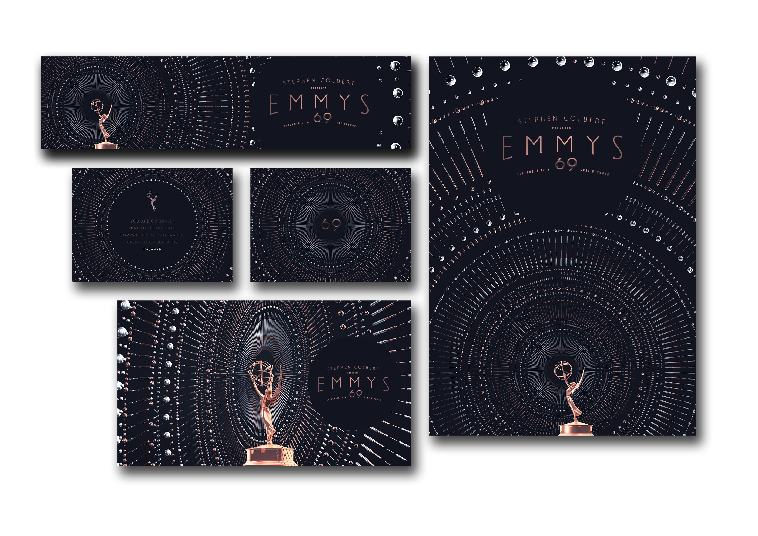
The visual identity of the 2017 Emmy Awards, created from the ground up for 2017, including Key art development, logo and logotype design and 47 different printed deliverables. Our work focusses on the deconstruction of the statuette itself, symbolising the ushering in of a new era.
Branding / Key Art / Logo Design
![]()

![]()

Primary Logotype – A customised Slab serif wordmark that blends modern sensibilities with a touch of nostalgia.
Custom Slab-Serif Typeface
![]()
One Colour Logo.
We developed a one colour logo that captures the dynamism of the key art in a stripped back form factor.

Route One – Stardust.
This concept focussed on deconstructing the iconic EMMYS statuette into fine particles of glitter.
![]()
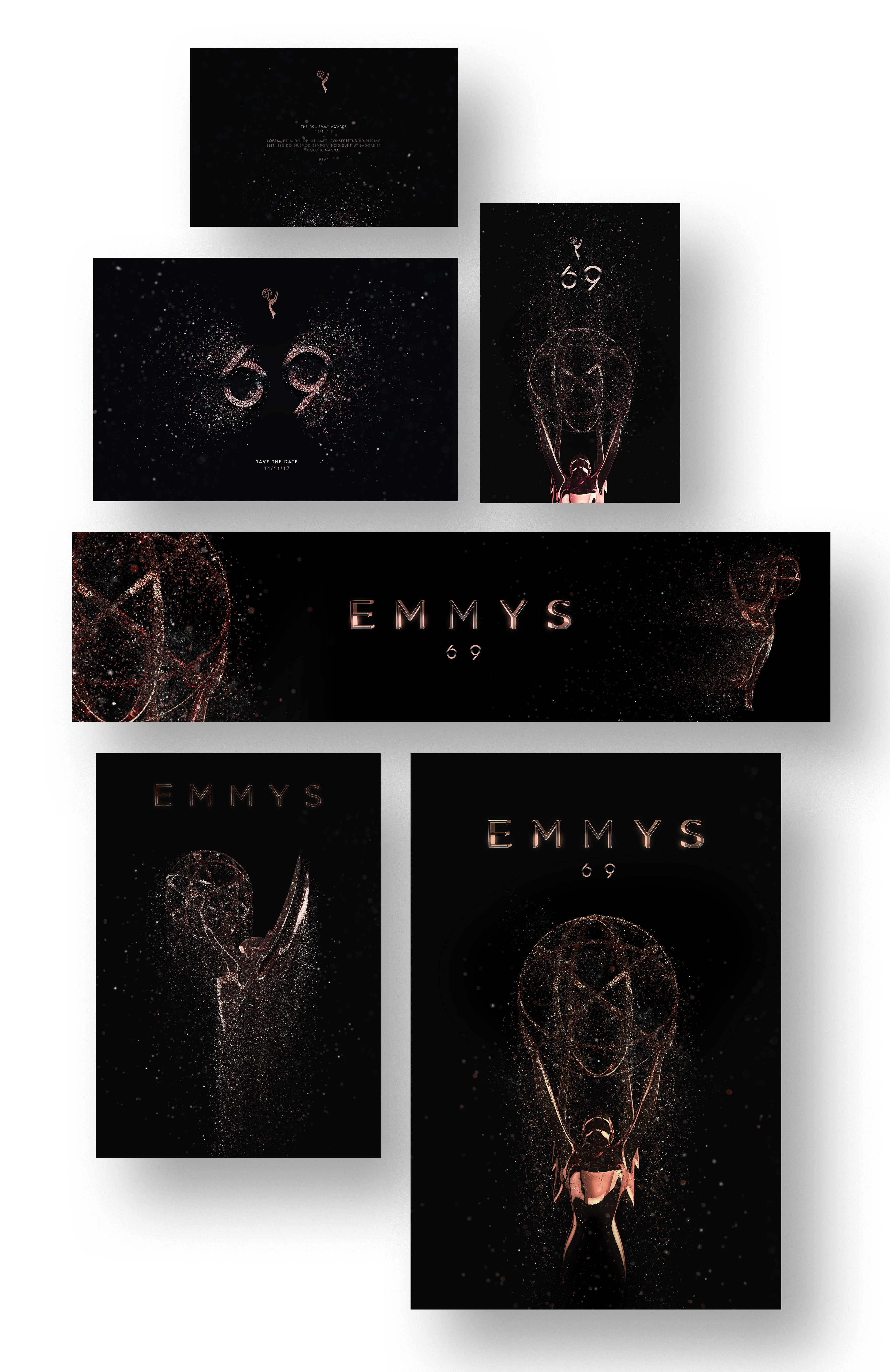
Route Two – Concentric.
This concept focussed on deconstructing the iconic EMMYS neutron ball into parts and blowing them out in concentric circles for a powerful and dynamic feel.
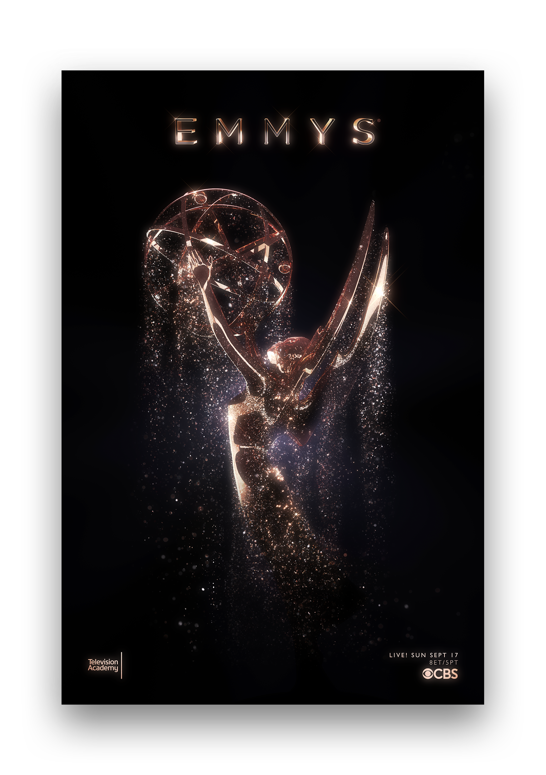
Final Key Art.
The final key art
– Vertically aligned.
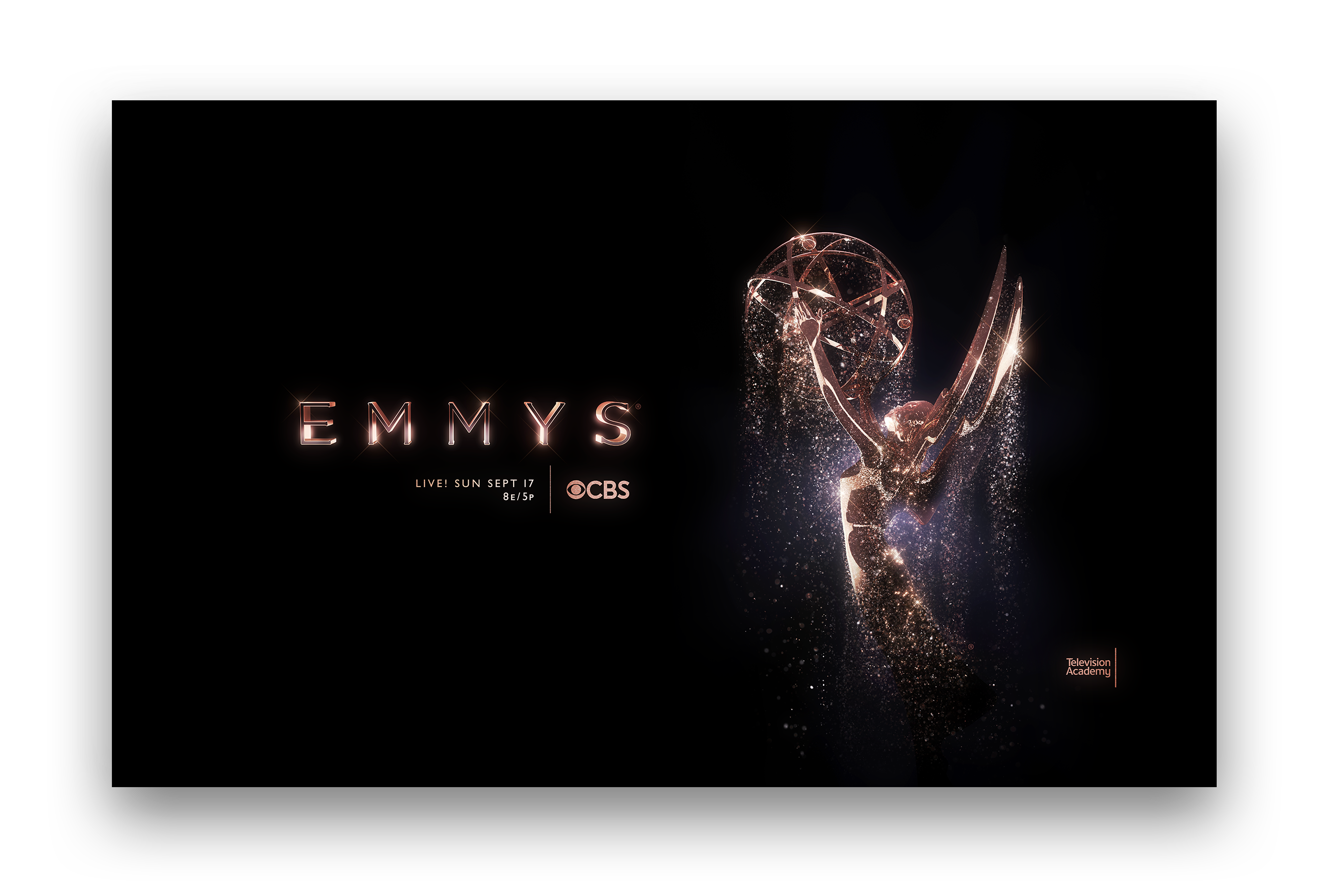
Final Key Art.
The final key art
– Horizontally aligned.